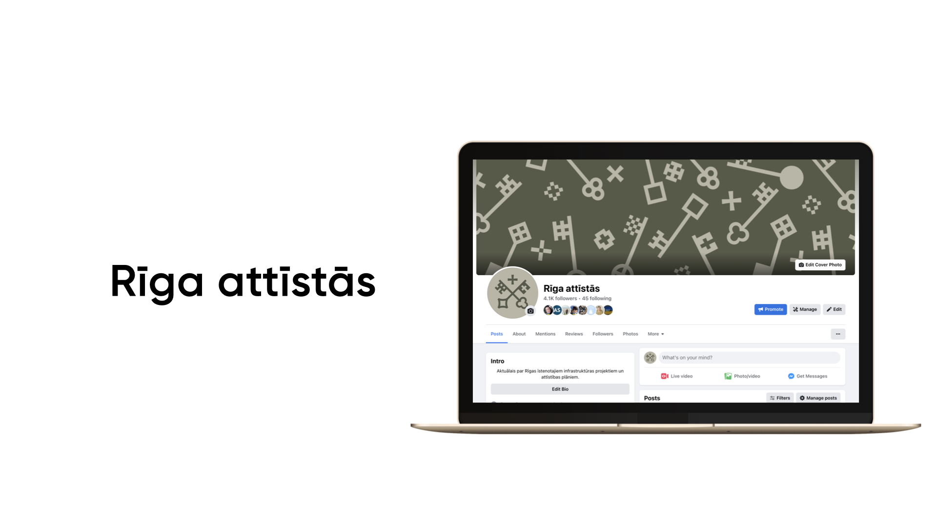
Rīgas sociālo mediju komunikācija jau labu laiku bija nepelnīti aizmirsta un vairāk kalpoja kā ziņu arhīvs un zibensnovedējs. Tomēr mēs zinājām, ka Rīgai ir liels potenciāls un ķērāmies pie darba. Pētot Rīgas sociālo tīklu komunikāciju, atklājām, ka pašvaldībai ir vairāk nekā 20 dažādas departamentu Facebook lapas - katra ar sarežģītu nosaukumu, nekonsekventu vizuālo valodu utt. Kā rezultātā nolēmām likvidēt liekos kontus un uz veiksmīgāko esošo kontu bāzes izveidojām piecus tematiskos kontus - Rīga, Rīga attīstās, Rīgā notiek ,Veselīga Rīga, Rīga mācās. Stratēģiski kārtojot kontus, neizbēgami bija jāaktualizē arī Rīgas vizuālā identitāte. Tas kalpoja kā impulss Rīgas zīmola atsvaidzināšanai un jaunizveidotie konti ieguva svaigu formu un vizuālo ietvaru. Rezultātā sāka augt sekotāju skaits, pieauga auditorijas iesaiste un mēs saņēmām arvien vairāk pozitīvus komentāru.
The social media communications of the city of Riga had been undeservedly forgotten for some time and served more as a news archive and lightning conductor for all those who did not like something in Riga. But we knew that Riga had something bigger to offer. When we started the research on Rigas social media communication, we realised that the municipality had more than 20 different pages for departments and their communication - with complex titles, inconsistent visual language etc. As a result, we eliminated redundant accounts and created ve accounts based on existing accounts with ve themes - Riga, Riga Develops, What's on Riga , Healthy Riga, Riga Learns. Arranging the accounts strategically, it was inevitable to update the visual identity of Riga as well. It served as an impulse for the Riga brand refresh and the accounts got a new shape and visual framework. As a result, the number of followers began to grow, audience engagement increased and we got more positive comments.